Optimize Growth with Analytics Dashboard and Conversion Optimization Tools
In this detailed guide, we will walk you through the FlavorCloud Analytics dashboard, how to best use it, and highlight some actionable strategies for a data-driven approach to growth. We will delve into FlavorCloud’s conversion optimization tools and metrics to demonstrate how to optimize conversions and build incremental revenue growth via illustrated examples.
For a shorter overview of the analytics dashboard, read The FlavorCloud Analytics Dashboard.
Using the Analytics Dashboard in FlavorCloud
The Analytics Dashboard in FlavorCloud allows you to track and analyze key metrics related to your orders and shipments. Below, you’ll find a quick guide on how to use the dashboard.
Start by choosing a date range and sampling interval (day, week, month, year) using the dropdown menus at the top of the dashboard.
Orders + Shipments by Date
This bar graph shows the number of orders and shipments over the selected date range.
At the top of the page, you can change the date range for the displayed data. You can also choose if you want to see your data by day, week, month, or year.
The graph shows vertical bars representing the orders and shipments for your chosen interval. If the bar is too small to display the data on the graph, you can mouse over a pair of bars and see the date and the number of orders and shipments for that date. The bars represent dates from left to right, with the far left being the beginning of the selected date range and the far right being the end.
In this graph, an order is any order created in or transmitted to the FlavorCloud system within the selected date range, regardless of whether the order was rated or fulfilled. A shipment is any order that has been fulfilled and had a shipping label generated, whether or not the shipment has been picked up or scanned by a carrier.

This visualization can help you track order and shipment volume over time and identify trends and patterns. If you see a significant gap between the two, it may indicate fulfillment issues. Use this data to adjust your fulfillment processes and ensure timely shipments.
Example 1: There is a sudden drop in shipments relative to orders.
Monitor the graph for misalignment between order and shipment peaks and troughs. This may point to other operational slippages, such as inadequate resources to fulfill orders promptly. Investigate whether any fulfillment issues are causing shipment delays, and if so, take steps to resolve them.
Example 2: The number of orders and shipments is increasing steadily.
Ensure that your fulfillment processes can scale to accommodate the growing demand, and consider investing in streamlining operations. Monitor the graph for operational slippage in orders rising faster than shipments.
Example 3: A consistent gap exists between the number of orders and shipments.
Evaluate the merchant’s shipping policies and fulfillment processes to meet customer expectations and explore opportunities to improve shipping speed and reliability.
By monitoring and analyzing trends in order and shipment data over time, merchants can make informed decisions about optimizing their fulfillment processes, improving customer satisfaction, and growing their business.
Orders by Country
The Orders by Country graph shows data for orders grouped by destination country within the selected date range.
At the top of the page, you can change the date range for the displayed data. The graph defaults to the top 10 countries, but you can change the number using the ‘Select’ drop-down. You can view the numbers for a single country by selecting it from the ‘country’ drop-down.
 The graph shows vertical bars representing the total number of orders. The bars are ordered from largest to smallest and from left to right. Hovering your mouse over a bar will display the name of the country and the total number of orders. Each vertical bar represents the total orders within the selected date range for the country the bar represents.
In this graph, an order is any order created in or transmitted to the FlavorCloud system within the selected date range, regardless of whether the order was rated or fulfilled.
This visualization can help you identify your top markets and adjust your marketing and fulfillment strategies accordingly.
Tailor your shipping and landed cost rules to these countries to improve conversion rates and reduce cart abandonment.
You can identify trends by comparing changes to the graph over time, such as month-over-month or year-over-year. If you notice large changes up or down, it is worth investigating. There may be carrier issues that need to be addressed or changes to the legal or regulatory landscape (e.g., additional duties on a particular product). A country growing in the top ten might justify additional marketing efforts.
Example: Upward Trend
You notice a significant uptick in orders from Germany over the past month.
One potential response to this trend could be to create targeted marketing campaigns to build on this momentum and increase brand awareness in that market. You may also use shipping and landed cost rules to incentivize a higher AOV as the market grows or create temporary discounts to keep your products competitive with local options while you build brand awareness. You should explore ways to improve the customer experience for German customers, such as offering local language support or adjusting your shipping and landed cost rules to align better with local expectations.
Example: Downward Trend
You notice a consistent drop in orders from Canada over the past quarter.
You should investigate any recent changes in Canadian regulations or shipping policies that could impact your business. If the downward trend is due to a temporary issue, you can use conversion optimization tools to mitigate customer impact. Also, consider running targeted promotions or discounts for Canadian customers to encourage them to return to your store. Finally, review your product offerings to ensure they are still meeting the needs and preferences of Canadian consumers.
Example: Volatile Trend
You notice that orders from Australia have been volatile over the past six months.
Are there certain times of the year when orders tend to spike or dip? Are any factors contributing to the volatility, such as seasonal trends or macroeconomic conditions? By understanding the underlying causes of these fluctuations, you can better prepare your business to adjust your marketing and fulfillment strategies accordingly.
Shipments by Country
The Shipments by Country graph shows shipment data grouped by destination country within the selected date range.
At the top of the page, you can change the date range for the displayed data. The graph defaults to the top 10 countries, but you can change the number using the ‘Select’ drop-down. You can view the numbers for a single country by selecting it from the ‘country’ drop-down.
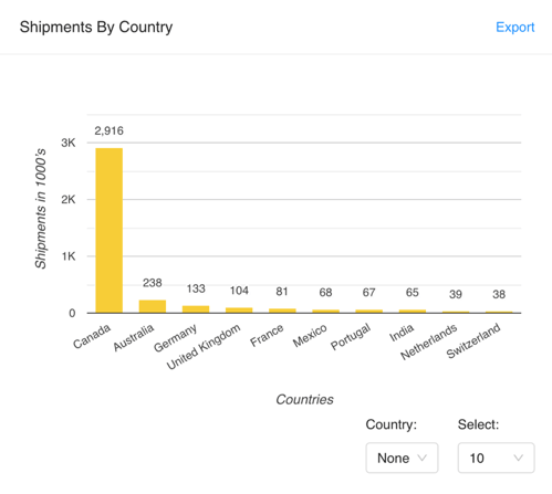 The graph shows vertical bars representing the total number of shipments. The bars are ordered from largest to smallest and from left to right. Hovering your mouse over a bar will display the name of the country and the total number of shipments. Each vertical bar represents the total orders within the selected date range for the country the bar represents.
A shipment is any order that has been fulfilled and had a shipping label generated, whether or not the shipment has actually been picked up or scanned by a carrier.
This visualization can help you identify your top markets and adjust your fulfillment and shipping strategies accordingly.
Optimize your shipping and landed cost rules for these countries to improve customer satisfaction and retention.
Reading Orders by Country vs. Shipments by Country
Trends, insights, and actions on the Orders by Country graph differ from those on the Shipments by Country graph. A rising trend in the number of orders by country may show an increased demand for your products in that market, while a rising trend in shipments may indicate that your fulfillment and shipping processes are improving.
Similarly, a falling trend in orders by country may suggest that demand for your products in that market is declining. In contrast, a falling trend may indicate fulfillment and shipping operations issues.
Insights and actions based on stable or volatile trends may also differ between Orders and Shipments by Country graphs. For example, suppose the number of orders from a particular country has been stable over time, but the number of shipments has been volatile. In that case, this may suggest that your fulfillment and shipping processes need improvement. On the other hand, if the number of orders and shipments has been stable over time, consider expanding your marketing efforts in that market to increase sales.
Example: Rising Trend
The number of shipments to Germany has steadily increased over the past few months.
Germany is becoming an increasingly important market. Consider investing in marketing and advertising in Germany to continue to grow the market. There could be a sudden increase in demand due to external factors. Allocate more resources to fulfill orders to this country and consider increasing marketing efforts to penetrate the market further.
Example: Falling Trend
The number of shipments to Japan has been declining over the past year.
There may be increased competition in the Japanese market or changing consumer preferences. Changes in customs regulations or trade policies may be impacting the ease or cost of shipping to the country. Conduct market research to understand the changing landscape and adjust shipping and fulfillment strategies to serve the Japanese market better.
Example: Stable/Stagnant Trend
The number of shipments to Canada has remained relatively stable over the past year.
Canada is a consistent market for the company with steady demand. Continue to optimize shipping and landed cost rules for Canada to maintain customer satisfaction and retention.
It could also be that the market has reached saturation for your products, or customers in this country may have consistent purchasing habits. Review customer feedback to identify areas for improvement and consider expanding product offerings to better cater to customer demand. Evaluate the potential of other markets to prioritize resource allocation.
Average Shipping Rate by Date
The Average Shipping Rate by Date trend line shows the average shipping rate to all destinations over time.
At the top of the page, you can change the date range for the displayed data. You can also choose how the data will be grouped, meaning the data points for that date range represent days, weeks, months, or years.
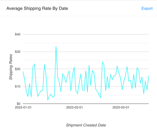 The line graph shows the average shipping rate for all destinations for each interval, e.g., the average shipping rate by day, week, month, or year. Hovering your mouse over a data point will display the date and the average shipping rate for the range for that date. The line represents dates within the range from left to right, with the date range beginning on the left and the end on the right.
The average shipping rate is calculated by adding all the shipping rates and dividing them by the total number of shipments in the selected grouping period. It provides a measure of the central tendency of the shipping rates. This is useful for understanding the overall average cost of shipping.
This visualization can help you track shipping costs and identify cost-saving opportunities.
If you notice an increase in your average shipping rate over time, it may indicate rising carrier costs. Adjust your shipping rates and remain competitive.
Because this data aggregates the shipping rate to all destination countries, the data can be quite noisy. When viewed over long periods, it can still provide valuable insights when combined with other data sets and analyzed over extended periods. Here are a few potential insights:
Seasonal trends: Even though the data is noisy, you may be able to identify seasonal trends in your shipping rates. For example, if your shipping rates tend to spike during the holiday season, you can plan and adjust your pricing strategy accordingly.
Carrier performance: If you notice that your shipping rates fluctuate wildly over time, it could indicate that one or more of your carriers are performing inconsistently.
Shipping policy impact: If you recently changed your shipping policies (e.g., by offering free shipping or adjusting your shipping rates), you can use the Shipping Rate by Date graph to see how those changes have impacted your overall shipping costs.
Overall shipping trends: While it may be challenging to identify specific trends for individual countries, you may be able to identify broader trends in your shipping costs. For example, if your shipping rates steadily increase, you can adjust your pricing strategy accordingly.
Example: Rising Trend
Over the selected date range, the average shipping rate has been increasing steadily.
Various factors, including carrier surcharges and the impact of packaging on dim weight vs. scale weight calculations, may influence this trend. In recent years, carriers have implemented surcharges for various reasons, such as fuel costs and peak season surcharges. Additionally, carriers may charge based on the higher dim weight if a package’s dimensional weight exceeds its scale weight, leading to increased shipping costs.
Merchants should evaluate their packaging practices to minimize the impact of dimensional weight on shipping costs. They may consider using smaller packaging or investing in packaging materials that reduce weight without compromising protection. Additionally, merchants may want to explore options for mitigating the impact of carrier surcharges.
Example: Falling Trend
Over the selected date range, the average shipping rate has decreased steadily.
This trend indicates that merchants are successfully reducing their shipping costs. This could be due to changes in shipping policies, better carrier negotiations, or improvements in their shipping processes. Merchants should continue to optimize their shipping processes to maintain the downward trend in shipping costs. They could also consider passing on some of the cost savings to their customers by lowering shipping rates or offering free shipping.
Example: Volatile Trend
Over the selected date range, the average shipping rate has fluctuated significantly.
This trend indicates that multiple factors contribute to shipping rate fluctuations. It could be due to changes in carrier costs, seasonal changes in shipping demand, or changes to shipping policies. Merchants should closely monitor their shipping costs and adjust their rates to remain competitive. They should also monitor trends and patterns to identify potential cost-saving opportunities.
Example: Periodic Trend
Over the selected date range, the average shipping rate has been following a repeating pattern.
This trend indicates that cyclical factors, such as seasonal changes in shipping demand, affect shipping costs. Merchants should adjust their shipping rates and processes accordingly to account for these seasonal changes in shipping demand. They should also consider offering promotions or discounts during slower shipping periods to encourage more sales.
Average Shipping Rate by Country
The Average Shipping Rate by Country graph shows data for shipments grouped by destination country within the selected date range.
At the top of the page, you can change the date range for the displayed data. The graph defaults to the top 10 countries, but you can change the number using the ‘Select’ drop-down. You can view the numbers for a single country by selecting it from the ‘country’ drop-down.
 The graph shows vertical bars representing the average shipping cost grouped by country. The bars are ordered from largest to smallest and from left to right. Hovering your mouse over a bar will display the name of the country and the average shipping cost for your chosen date range. Each vertical bar represents the average shipping cost within the selected date range for the country the bar represents.
The average shipping rate is calculated by adding all the shipping rates and dividing them by the total number of shipments in the selected grouping period. It provides a measure of the central tendency of the shipping rates. This is useful for understanding the overall average cost of shipping.
This visualization can help you identify cost-saving opportunities by country.
Adjust your shipping rates for these countries to improve conversion rates and reduce cart abandonment.
Example: Rising Trend
The average shipping rate by country has steadily increased over the selected date range.
This trend may indicate that carrier costs or other factors affecting shipping rates have increased for the countries in question. Merchants could consider adjusting their shipping rates for these countries or explore alternative shipping options to help manage costs.
Example: Falling Trend
The average shipping rate by country has consistently decreased over the selected date range.
This trend may indicate that carriers offer more competitive rates or that the merchant is optimizing their shipping strategies. Merchants should review their shipping strategies and continue optimizing for cost and efficiency while monitoring carrier performance.
Example: Stable Trend
The average shipping rate by country has remained stable over the selected date range.
This trend may indicate that these countries’ market conditions and shipping landscape are relatively unchanged. Alternatively, this trend may mean that the merchant needs to explore cost-saving opportunities. Merchants can continue to monitor the shipping rates for these countries and adjust their shipping strategies as required, but they should also focus on other areas for optimization.
Example: Periodic Trend
The average shipping rate by country experiences periodic fluctuations over the selected date range.
This trend may indicate seasonal fluctuations in shipping demand or regular carrier pricing adjustments. This trend may also suggest that the merchant is experiencing instability in their carrier network or supply chain. Merchants should analyze the data for each country to identify patterns and adjust their shipping strategies accordingly to optimize cost and efficiency during peak and off-peak periods.
Average Landed Cost by Date
The Average Landed Cost by Date trend line shows the average shipping rate to all destinations over time.
At the top of the page, you can change the date range for the displayed data. You can also choose how the data will be grouped, meaning the data points for that date range represent days, weeks, months, or years.
The line graph shows the average landed cost for all destinations for each interval, e.g., the average landed cost by day, week, month, or year. Hovering your mouse over a data point will display the date and the average landed cost for the range for that date. The line represents dates within the range from left to right, with the date range beginning on the left and the end on the right.
The average landed cost is calculated by adding all the landed costs and dividing them by the total number of shipments in the selected grouping period. It provides a measure of the central tendency of the landed cost.
If you notice an increase in your average landed cost over time, it may indicate rising product costs or changes to the cross-border regulatory landscape.
Adjust your pricing strategy and remain competitive.
Merchants should know the international compliance and regulatory implications of landed costs. Failure to comply with regulatory requirements can result in costly fines and damage the merchant’s reputation. Staying up-to-date on regulatory changes and maintaining compliance with all applicable laws and regulations is essential.
Example: Rising Trend
Over the selected date range, the average landed cost has increased steadily.
This trend indicates that product costs or costs from cross-border regulations may increase, potentially impacting profit margins. Merchants could consider adjusting their pricing strategy to account for rising landed costs. They could also explore alternative sourcing options or adapt their product mix to maintain profitability.
Example: Falling Trend
Over the selected date range, the average landed cost has decreased steadily.
This trend indicates a potential cost-saving opportunity or decreased regulatory or product costs. Merchants could take advantage of the cost-saving opportunity by adjusting pricing or considering expanding product offerings. Alternatively, they could investigate the reasons behind the decrease and ensure that any changes are sustainable.
Stable/Stagnant Trend:
Over the selected date range, the average landed cost has remained relatively stable.
This trend indicates that product and regulatory costs have remained consistent. Merchants could monitor the trend to ensure that costs remain stable and adjust the pricing or product offerings if necessary. They could also explore opportunities for cost savings through alternative sourcing or regulatory compliance strategies.
Volatile Trend:
The average landed cost fluctuates significantly over the selected date range.
This trend indicates that external factors, such as changes in regulatory compliance or supply chain disruptions, may influence landed costs. Merchants could investigate the causes of the volatility and adjust their sourcing, pricing, or product offerings accordingly. They could also consider implementing risk management strategies to mitigate the impact of future cost fluctuations.
Average Landed Cost by Country
The Average Landed Cost by Country graph shows shipment data grouped by destination country within the selected date range.
At the top of the page, you can change the date range for the displayed data. The graph defaults to the top 10 countries, but you can change the number using the ‘Select’ drop-down. You can view the numbers for a single country by selecting it from the ‘country’ drop-down.
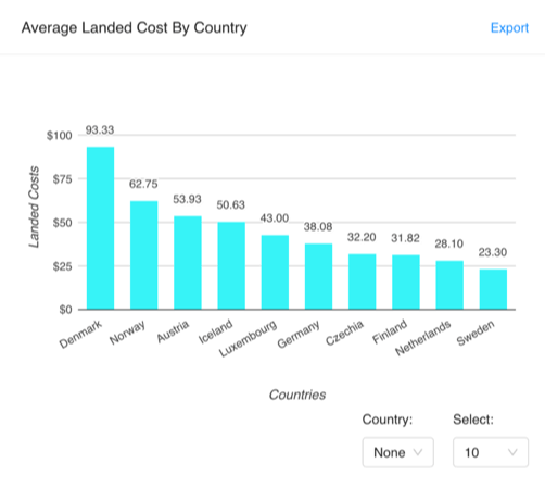 The graph shows vertical bars representing the average landed cost grouped by country. The bars are ordered from largest to smallest and from left to right. Hovering your mouse over a bar will display the name of the country and the average landed cost for your chosen date range. Each vertical bar represents the average landed cost within the selected date range for the country the bar represents.
The average landed cost is calculated by adding all the landed costs and dividing them by the total number of shipments in the selected grouping period. It provides a measure of the central tendency of the landed cost. This is useful for understanding the overall average landed cost.
This visualization can help you identify cost-saving opportunities by country.
Adjust your landed cost rules for these countries to improve customer satisfaction and retention.
Merchants should know the international compliance and regulatory implications of landed costs. Failure to comply with regulatory requirements can result in costly fines and damage to the merchant’s reputation. Staying up-to-date on regulatory changes and maintaining compliance with all applicable laws and regulations is essential.
Example: Rising Trend
Over the selected date range, the average landed cost for a particular country has been increasing steadily.
This trend indicates that the cost of importing products to that country is rising. It could be due to changes in customs regulations, currency exchange rates, or import tariffs. Merchants could consider adjusting their pricing strategy or renegotiating terms with suppliers to offset the rising landed costs. They could also explore other markets or shipping options to minimize costs.
Example: Falling Trend
Over the selected date range, the average landed cost for a particular country has been decreasing steadily.
This trend indicates that the cost of importing products to that country is decreasing. It could be due to changes in customs regulations, currency exchange rates, or import tariffs. Merchants could adjust their pricing strategy to remain competitive in the market. They could also consider investing more resources into marketing efforts to capitalize on the cost-saving opportunity and attract more customers.
Example: Volatile Trend
Over the selected date range, a particular country’s average landed cost has fluctuated rapidly.
This trend indicates the cost of importing products to that country is experiencing significant fluctuations. It could be due to changing market conditions, political instability, or currency fluctuations. Merchants could closely monitor the trend and adjust their pricing strategy accordingly. They could also consider exploring other markets or shipping options to mitigate risk and reduce the impact of volatile landed costs. Additionally, they should stay informed of any regulatory or compliance changes in the market to avoid legal or financial repercussions.
Average Order Value by Date
The Average Order Value by Date trend line shows the Average Order Value (AOV) to all destinations over time.
At the top of the page, you can change the date range for the displayed data. You can also choose how the data will be grouped, meaning the data points for that date range represent days, weeks, months, or years.
The line graph shows the AOV for all destinations for each interval, e.g., the AOV by day, week, month, or year. Hovering your mouse over a data point will display the date and the AOV for the range for that date. The line represents dates within the range from left to right, with the date range beginning on the left and the end on the right.
The AOV is calculated by adding all the order values and dividing them by the total number of orders in the selected grouping period. It provides a measure of the central tendency of the order values.
This visualization can help you track revenue and identify trends and patterns.
Use this graph to track your average order value changes over time. If you notice a decline, it may indicate customer dissatisfaction or pricing issues. Adjust your pricing strategy and improve customer retention.
Example: Rising Trend
Over the selected date range, the average order value has been increasing steadily.
This trend indicates that customers are purchasing higher-priced items or more items per order, which can increase revenue. Consider offering incentives to encourage customers to buy more items per order or upsell higher-priced items. Adjust shipping rules to offer discounts for higher AOV orders.
Example: Falling Trend
Over the selected date range, the average order value has decreased steadily.
This trend indicates that customers are purchasing lower-priced items or fewer items per order, which can lead to lower revenue. Consider offering promotions or bundles to encourage customers to buy more items per order or upsell higher-priced items. Adjust shipping rules to offer discounts for higher AOV orders.
Example: Stable/Stagnant Trend
Over the selected date range, the average order value has remained relatively stable.
This trend indicates that customers consistently purchase comparable prices and quantities. Consider conducting customer surveys to determine if there are opportunities to offer higher-priced items or to bundle products to increase AOV. Adjust shipping rules to offer discounts for higher AOV orders.
Example: Periodic Trend
The average order value fluctuates regularly over the selected date range.
This indicates that external factors like seasonal trends may impact customer purchasing habits. Consider adjusting pricing strategies or product offerings to align with seasonal trends. Adjust shipping rules to offer discounts for higher AOV orders during peak seasons.
Average Fulfillment Time
The Average Fulfillment Time trend line shows the average time between an order’s creation and fulfillment.
At the top of the page, you can change the date range for the displayed data. You can also choose how the data will be grouped, meaning the data points for that date range represent days, weeks, months, or years.
The line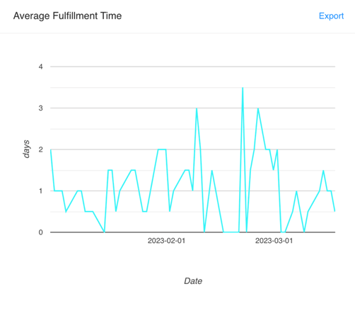 graph shows the average fulfillment time for all destinations for each interval, e.g., by day, week, month, or year. Hovering your mouse over a data point will display the date and the average fulfillment time for the range for that date. The line represents dates within the range from left to right, with the date range beginning on the left and the end on the right.
The average fulfillment time is calculated by adding all the fulfillment times and dividing them by the total number of orders in the selected grouping period. It provides a measure of the central tendency of the fulfillment times. In this graph, an order is any order created in or transmitted to the FlavorCloud system that has been fulfilled within the selected date range.
This visualization can help you track fulfillment efficiency and identify opportunities for improvement.
If you notice an increase, it may indicate issues with your fulfillment processes. Adjust your fulfillment processes and improve customer satisfaction.
Example: Rising Trend
Over the selected date range, the average fulfillment time has increased steadily.
This trend indicates that there may be issues with fulfillment processes. It could be due to various reasons, such as increased order volume, staff shortages, or changes in fulfillment policies. Merchants could consider adjusting their fulfillment processes to keep up with rising order volume. They could also explore hiring additional staff or outsourcing to a third-party logistics service (3PL).
Example: Falling Trend
Over the selected date range, the average fulfillment time has decreased steadily.
This trend indicates that the fulfillment processes are becoming more efficient. This could be due to streamlining the process, reducing order volume, or improving staffing. Merchants should continue to monitor the fulfillment processes and identify areas for further improvement. They could also consider implementing incentives for staff or outsourcing to a third-party logistics service (3PL) to maintain or improve efficiency.
Example: Stable/Stagnant Trend
Over the selected date range, the average fulfillment time has remained relatively stable.
This trend indicates that the fulfillment processes are consistent and efficient. However, it may also show room for improvement and optimization. Merchants should continue to monitor the fulfillment processes and look for opportunities to improve efficiency. They could consider implementing new technologies or outsourcing to a third-party logistics service (3PL) to optimize the process.
Example: Periodic Trend
Over the selected date range, the average fulfillment time fluctuates in a pattern.
This trend indicates that seasonal or cyclical factors may impact the fulfillment process. For example, order volume may increase during the holiday season or decrease during the off-season. Merchants should plan for seasonal fluctuations and adjust staffing or fulfillment processes accordingly. They could also consider implementing incentives for staff or outsourcing to a third-party logistics service (3PL) to maintain or improve efficiency during peak periods.
Average Transit Time
The Average Transit Time trend line shows the average time between when a shipment is picked up by the carrier and the shipment’s delivery to the destination address.
At the top of the page, you can change the date range for the displayed data. You can also choose how the data will be grouped, meaning the data points for that date range represent days, weeks, months, or years.
![]() The line graph shows the average time between pickup and delivery for all destinations for each interval, e.g., the time between pickup and delivery by day, week, month, or year. Hovering your mouse over a data point will display the date and the average time between pickup and delivery for the range for that date. The line represents dates within the range from left to right, with the date range beginning on the left and the end on the right.
The line graph shows the average time between pickup and delivery for all destinations for each interval, e.g., the time between pickup and delivery by day, week, month, or year. Hovering your mouse over a data point will display the date and the average time between pickup and delivery for the range for that date. The line represents dates within the range from left to right, with the date range beginning on the left and the end on the right.
The average transit time is calculated by adding all the transit times and dividing them by the total number of shipments in the selected grouping period. It provides a measure of the central tendency of the transit times. In this case, a shipment is any order that has been fulfilled, had a shipping label generated, and has been scanned during pickup by the carrier.
This visualization can help you track shipping efficiency and identify opportunities for improvement.
If you notice an increase, it may indicate issues with your carrier or shipping processes. Adjust your shipping processes and improve customer satisfaction.
Incorrect customs information, such as HS Codes, Customs Valuations, Country of origin, and inadequate product descriptions, can cause delays and lead to longer transit times.
Example: Rising Trend
Over the selected date range, the average transit time has been increasing steadily.
If you notice a steady increase in the average transit time, it may indicate that your current shipping and customs processes could be more efficient, or there may be issues with the carriers you’re using. Adjust your shipping and customs processes and ensure that you have accurate customs information, such as HS Codes, Customs Valuations, Country of origin, and adequate product descriptions.
Example: Falling Trend
Over the selected date range, the average transit time has decreased steadily.
If you notice a steady decrease in the average transit time, it may indicate that your current shipping and customs processes are effective or that your carriers are performing better. Monitor the trend closely to ensure it remains stable and consider implementing shipping and customs processes that further improve efficiency.
Example: Stable/Stagnant Trend
Over the selected date range, the average transit time has remained relatively stable.
Suppose you notice that the average transit time remains relatively stable. In that case, it may indicate that your current shipping and customs processes are effective or that your carriers perform consistently. Consider implementing more advanced shipping and customs processes to improve efficiency or monitor the trend for changes that could indicate potential issues.
Average Pickup Time
The Average Pickup Time trend line shows the average time between when an order is fulfilled and becomes a shipment and when the carrier picks it up.
At the top of the page, you can change the date range for the displayed data. You can also choose how the data will be grouped, meaning the data points for that date range represent days, weeks, months, or years.
 The line graph shows the average pickup time for all destinations for each interval, e.g., the time between fulfillment and pickup by day, week, month, or year. Hovering your mouse over a data point will display the date and the average pickup time for the range for that date. The line represents dates within the range from left to right, with the date range beginning on the left and the end on the right.
The average pickup time is calculated by adding all the pickup times and dividing them by the total number of shipments in the selected grouping period. It provides a measure of the central tendency of the pickup times. In this case, a shipment is any order that has been fulfilled, had a shipping label generated, and has been scanned during pickup by the carrier.
This visualization can help you track fulfillment efficiency and identify opportunities for improvement.
If you notice an increase in your average pickup time, it may indicate issues with your carrier or shipping processes. Adjust your shipping processes and improve customer satisfaction.
Example: Rising Trend
A consistent increase in your average pickup time may indicate that your current picking and packing operations need help to keep up with demand. Consider adding more staff or optimizing your current processes to improve efficiency and reduce the pickup time.
Example: Falling Trend
A consistent decrease in your average pickup time may indicate that your current picking and packing operations are becoming more efficient. Monitor your pickup times to ensure the trend continues, and consider investing in additional resources to maintain the momentum.
Example: Stable/Stagnant Trend
A consistent average pickup time may indicate that your current picking and packing operations are working well. Consider maintaining your existing processes and look for opportunities to optimize them and reduce costs.
Example: Volatile Trend
A trend of fluctuating pickup times with no apparent pattern may indicate that your picking and packing operations are experiencing unpredictable disruptions. Analyze your data to identify the root cause of these disruptions and implement measures to mitigate their impact.
Ensuring you have the right pick-up schedule and the right picking and packing operations is essential to ensure timely and efficient fulfillment.
Maximizing Insights: Correlating Data Across Multiple Graphs
Correlating data from different graphs on a business dashboard can provide valuable insights into the performance of your business operations. By examining the relationships between various metrics, you can identify trends, patterns, and opportunities for improvement that might be absent when looking at individual data points in isolation. The following examples explore how correlating information from different graphs can generate unique and actionable insights to improve business operations. These examples also demonstrate the importance and utility of utilizing all the data available to you and utilizing it effectively to make informed decisions for your business.
Example 1:
Graphs: Average order value by date, Average transit time
By correlating average order value by date and average transit time, we can identify if there is a relationship between delivery time and order value. If we find a correlation, we can investigate why it exists and take steps to improve delivery times to improve customer satisfaction and revenue. For example, if we notice that delivery times increase during peak demand periods, we can allocate additional resources to our shipping processes during those periods.
Example 2:
Graphs: Average transit time, Average fulfillment time
By correlating average transit time and average fulfillment time, we can identify if there is a correlation between the two. If there is, we can investigate whether any inefficiencies in the fulfillment process are causing longer transit times. We can then improve fulfillment processes to reduce transit times and improve customer satisfaction.
Example 3:
Graphs: Average landed cost by country, Average order value by date
We can identify countries where we may increase profitability by correlating average landed cost by country and average order value by date. If we notice that a particular country has a high average order value and a low landed cost, we can increase our margins by increasing our prices for that country. Conversely, suppose we notice that a particular country has a low average order value and a high landed cost. In that case, we may consider reducing our prices or adjusting our shipping processes to reduce costs.
Example 4:
Graphs: Average pickup time, Average fulfillment time
By correlating average pickup time and average fulfillment time, we can identify if there is a relationship between the two. If we find a correlation, we can investigate whether any inefficiencies in the picking and packing are causing longer pickup times. We can then improve the picking and packing processes to reduce pickup times and improve customer satisfaction.
Example 5:
Graphs: Average transit time, Average landed cost by country
By correlating average transit time and average landed cost by country, we can identify countries where we may reduce costs by improving transit times. Suppose a particular country has a high landed cost and a long transit time. In that case, we should investigate whether any inefficiencies in our shipping processes are causing longer transit times. We can then take steps to improve shipping processes to reduce transit times and reduce costs.
For exporting analytics, please refer to the Exports for Custom Reports and Comparisons
Conversion Optimization Tools
FlavorCloud’s Conversion Optimization tools are designed to help you increase your sales and revenue by optimizing your shipping and landed cost rates.
Shipping and Landed Cost Rules allow you to create markups and discounts based on various factors:
Duration
With the duration option, you can set the length of time the rule is in effect. This allows you to run promotions or discounts for specific periods, such as during a holiday season or for a limited-time sale. Duration is chosen by picking a start and end date.
Rule Type
Four rule types are available: Free shipping/landed cost, flat amount, discount, and markup. These options allow you to choose the kind of discount or markup that will work best for your business and help you achieve your desired conversion goals. To use Flat Amount, you chose must supply the value in USD. To use Discount or Markup, you must choose a dollar amount or a percent.
Order Value
It is important to remember that all business rule values are in USD. If you want to create a business rule in a different currency, you should convert the currency to USD and create the rule based on that amount. It’s recommended that when you create a business rule based on a converted currency, you include a modest buffer to account for the usual fluctuations in values between currencies. You should also review these rules periodically to ensure the USD value is still accurate for the rule’s intended use.
Service Level
You can trigger the rule by the service level. You can apply the rule only to specific service levels, such as standard or express. You can also choose to exclude service levels from the rule. It is important to note that all orders over $800 USD must ship Express. For any order that exceeds $800 USD, a free standard shipping rule, for example, would not apply because the order is not eligible for standard shipping. If you wanted to make a rule to apply to the order, you would need to have it triggered by the order amount and, if needed, restrict its applicability in other ways.
Apply To (Landed Cost Rules)
This allows you to choose what part of the landed cost the rule applies to: duties, taxes, fees, or any combination.
Location
The location option lets you trigger the rule by the destination country. This allows you to offer different discounts or markups to customers in different countries. For example, you can provide free shipping to customers in Canada and Mexico but exclude customers in the EU. You can also select regions to apply the rule to, which will include all the countries in the region.
Display Free Shipping Deadline (Shipping Cost Rules)
When this option is enabled, the free shipping deadline displays at checkout during the last 30 days of rule eligibility.
Offset Landed Cost Discounts (Landed Cost Rules)
You can also offset landed cost discounts by rolling them into shipping costs. This helps you maintain pricing transparency while offering customers discounts on landed costs.
Conversion Optimization Examples
FlavorCloud’s analytics dashboard and conversion optimization tools allow merchants to improve their bottom line through informed decision-making. Using the available data, merchants can make data-driven decisions to optimize their shipping and landed cost rules, ultimately leading to incremental revenue growth.
This section presents examples of how merchants can use FlavorCloud’s tools to improve their business. The companies and examples are fictitious and illustrative. Ultimately any implementation of markups and discounts to shipping or landed costs must be based on the specific needs and circumstances of the business.
Brightcore Lighting
After analyzing their analytics dashboard, Brightcore notices that their international average shipping rate has steadily increased for the past few weeks.
They create a landed cost rule that offers a discount on shipping rates for orders over $50 and offset the discount by increasing their shipping rates for orders under $50 slightly. The rule will be in effect for two weeks.
They plan to evaluate the results by comparing the shipping rates and order values during the two-week period to the previous two weeks.
How to build the business rules used in this example:
Shipping Cost Rule
- Rule Name“Shipping Rate Discount for orders over $50”
- DurationChoose a start date and an end date 2 weeks later.
- Rule TypeDiscount, 10%
- Order ValueExceeds: $49.99
- Service LevelsStandard & Express
- LocationsLeave blank
- Display Free Shipping DeadlineLeave unchecked
Shipping Cost Rule
- Rule Name“Shipping Rate Discount for orders over $50”
- DurationChoose a start date and an end date 2 weeks later.
- Rule TypeDiscount, 2%
- Order ValueExceeds: $50.00
- Service LevelsStandard & Express
- LocationsLeave blank
- Display Free Shipping DeadlineLeave unchecked
The name of the rule and the exact numbers were chosen to be illustrative and are arbitrary; if you were making a similar rule, you would use a name that was memorable and easy for you to understand and would choose the amounts of the discount and markup based on your specific business needs.
Naturescent
Naturescent notices that their cart abandonment rate has been increasing steadily for the past month. After analyzing their analytics dashboard and correlating with other data, they identify that many abandoned carts are from customers in Canada.
They create a shipping rule that offers free shipping to customers in Canada for orders over $100, but only for express orders.
The rule will be in effect for one month. They plan to evaluate the results by comparing the order values and shipping costs for Canadian customers during the one-month period to the previous month.
How to build the business rule used in this example:
Shipping Cost Rule
- Rule Name“Canada Express Free Shipping”
- DurationChoose a start date and an end date 1 month later.
- Rule TypeFree Shipping
- Order ValueExceeds: $99.99
- Service LevelsExpress
- LocationsCanada
- Display Free Shipping DeadlineLeave unchecked
Nutriplusia Dietire
Nutriplusia Dietire, a dietary supplement company, wants to increase sales to customers in Asia.
They create a shipping rule that offers free shipping on orders over $75, and a landed cost rule that offsets the cost of the discount by slightly increasing the landed cost. These rules are created for a selection of countries in the target region.
They plan to evaluate the result in two weeks by comparing the abandonment rate before and after implementing the new rule.
How to build the business rules used in this example:
Shipping Cost Rule
- Rule Name“Asia Free Shipping over $75”
- DurationChoose a start date and an end date 2 weeks later.
- Rule TypeFree Shipping
- Order ValueExceeds: $74.99
- Service LevelsStandard & Express
- LocationsAsia
- Display Free Shipping DeadlineLeave unchecked
Landed Cost Rule
- Rule Name“Asia Free Shipping Offset”
- DurationChoose a start date and an end date 2 weeks later.
- Rule TypeMark up, $10 USD
- Order ValueExceeds: $74.99
- Service LevelsStandard & Express
- Apply ToDuties, Taxes, and Fees
- LocationsAsia
- Offset Landed Cost Discount/MarkupLeave unchecked
Decosynergy
Decosynergy, a home goods retailer, observes increased customer complaints for international orders. They discover that many of the complaints correlate to DDU and standard orders.
They create a shipping rule offering free express shipping on orders over $75. They also make a landed cost rule offering flat-rate landed costs slightly below the median in affected lanes to encourage customers to use DDP, as express and DDP offer better customer experiences.
After four weeks, they plan to evaluate the result by comparing the YoY and MoM sales data.
Shipping Cost Rule
- Rule Name“Free Shipping over $75 Top Lanes”
- DurationChoose a start date and an end date 4 weeks later.
- Rule TypeFree Shipping
- Order ValueExceeds: $74.99
- Service LevelsExpress
- LocationsEurope, North America, Australia
- Display Free Shipping DeadlineCheck to enable
Landed Cost Rule
- Rule Name“Flat Rate Top Lanes”
- DurationChoose a start date and an end date 4 weeks later.
- Rule TypeFlat Amount, $10.00 USD
- Order ValueNot Applicable
- Service LevelsExpress
- Apply ToDuties, Taxes, and Fees
- LocationsEurope, North America, Australia
- Offset Landed Cost Discount/MarkupLeave unchecked
Merchants can optimize international sales by utilizing the available data and creating a plan for addressing what they observe. The examples presented in this section demonstrate how FlavorCloud’s tools can be used to identify areas for improvement, devise a plan of action, create effective business rules, and evaluate the results. By following these steps, merchants can improve their business and grow their revenue.
Tips and Guidance for Conversion Optimization
By using these Conversion Optimization tools and analyzing the data provided in the analytics dashboard, you can make informed decisions about optimizing your shipping and landed cost rates to increase sales and revenue. For example, you might offer free shipping to customers in a particular country during a specific period or offer a discount on orders over a particular value to incentivize larger purchases.
Creating effective conversion optimization strategies requires analyzing and interpreting relevant data. In addition to the data provided by the analytics dashboard, several cross-border ecommerce metrics can be used to inform conversion optimization decisions:
- Average Order Value (AOV): Knowing the AOV can help determine whether offering discounts or promotions will effectively increase sales.
- Cart Conversion and Abandonment: Tracking the percentage of abandoned carts can help identify areas where checkout or shipping processes could be improved to reduce cart abandonment.
- % of Shipments that are Standard vs. Express: Understanding the proportion of standard versus express shipments can help with inventory management and forecasting and inform shipping promotions or discounts.
- Volume and AOV by Lane: Analyzing shipping volume and AOV by specific lanes or routes can help identify opportunities to optimize pricing and promotions based on customer behavior and demand.
To gauge the impact of a business rule, running a limited trial can be helpful. To ensure success, establish clear goals and metrics upfront. Choose a limited group of customers to test the rule by segmenting your customer base based on criteria like geography, order value, or order frequency. By limiting the scope of the trial, you can minimize any potential negative impacts.
After the trial, analyze the data to determine the impact of the business rule on relevant metrics. If the trial is successful, you can consider rolling out the rule to a larger group of customers or implementing it company-wide. If the trial is unsuccessful, revise the rule or scrap it altogether.
Run Experiments and Compare Apples to Apples
When running a conversion optimization test, it’s essential to ensure that you are comparing apples to apples. This means you must keep all other variables constant except for the one you are testing. For example, if you are testing the effect of a free shipping offer, ensure all other aspects of the website, such as product prices and promotions, remain the same for both the test and control groups.
To accurately assess the impact of a specific business rule, run experiments with a control group and a test group that are as similar as possible in terms of customer behavior, geography, and other relevant factors. If there is no good concurrent control candidate, month-over-month or year-over-year data can be used for comparison.
To effectively run experiments and compare results, tracking relevant metrics such as Average Order Value (AOV), Cart Conversion and Abandonment, % of shipments that are Standard vs. Express, % of shipments that are DDU vs. DDP, and Volume and AOV by lane. Tracking these metrics consistently across experiments, you can understand how shipping changes and landed cost rules affect the bottom line.
Decide Whether the Juice is Worth the Squeeze
Before investing time and resources into a particular conversion optimization campaign, evaluating whether the potential benefits are worth the costs is essential. Consider the impact of the change on revenue and profit, as well as the costs of implementing and testing the change. You may also consider the opportunity cost of not pursuing other initiatives.
Using data like AOV and Cart Conversion and Abandonment, you can estimate the potential impact of a new rule on overall revenue and conversion rates, helping you make informed decisions about which experiments are worth pursuing.
When deciding whether the juice is worth the squeeze, it’s essential to consider the potential impact on key metrics like AOV, conversion rates, and shipping costs. AOV and conversion rates can provide insight into the effectiveness of promotional offers or discounts. At the same time, shipping costs can help determine whether implementing a free shipping threshold or increasing shipping prices will positively impact profit margins.
Measure the Impact of Business Rules
Conversion optimization requires the ability to measure the impact of different business rules. Make sure you are using the right tracking tools to measure the impact of changes. This includes the FlavorCloud Analytics Dashboard and tracking codes or other analytics software. This data will make assessing whether a rule has the desired effect easier.
You can evaluate whether a new rule has the desired effect by tracking relevant metrics such as AOV, Cart Conversion/Abandonment, % of shipments that are Standard vs. Express, % of shipments that are DDU vs. DDP, and Volume and AOV by lane. For example, suppose you implement a new rule offering free shipping on orders over a specific value. In that case, you can track changes in AOV and Cart Conversion to determine whether the rule drives increased sales.
To tell if a business rule has the desired effect, regularly monitor and analyze data on key performance indicators like AOV, conversion rates, and shipping costs. It’s also essential to track the success of specific rules or experiments over time, comparing results to past performance and industry benchmarks.
Choose the Best Times to Add New Rules and Run Tests
It’s essential to run conversion optimization tests at times when ecommerce background noise is minimized. In this context, “noise” refers to any random variation or fluctuation in the data irrelevant to the analysis. This can include external factors, such as holidays or political unrest, and other data variability sources. The presence of noise can make it more difficult to identify meaningful trends or correlations in the data. It can lead to false conclusions or misleading results if not adequately accounted for.
For example, running tests or evaluating the performance of business rules during the holiday or other peak shopping periods may make it difficult to isolate the rule’s impact on sales, as many other factors may simultaneously affect sales. By choosing a quieter period to run tests, you can more accurately measure the impact of your new rules. This can help ensure that any changes in key metrics result from the business rule, not external factors.
Noisy Data is Lumpy
When analyzing conversion optimization data, it’s important to remember that data can be noisy and that trends may only sometimes be linear. The more noise in your data, the more you might find false correlations. This is particularly true when dealing with cross-border ecommerce metrics, where factors like local holidays, customs delays, regulatory changes, and political unrest can significantly impact shipping and fulfillment times. When analyzing conversion optimization data, looking for trends over time and considering potential external factors influencing the data is essential. By taking a nuanced approach to data analysis, you can make more informed decisions and avoid conclusions based on noisy or misleading data.
Corroborate your Conclusions
When making decisions based on conversion optimization data, it’s vital to corroborate your conclusions using multiple data sources. This can help ensure that any conclusions you draw are accurate and reliable. You may consider cross-referencing conversion optimization data with data from other sources, such as customer feedback, product reviews, or social media analytics. This can help you better understand the impact of your business rules and determine whether multiple data sources support your conclusions.
Iterate and Refine
Conversion optimization is an ongoing process that requires iteration and refinement. After evaluating a rule for some time, take the time to analyze the results and identify areas for improvement. Use this information to refine your approach and identify new opportunities for testing.
Keep an Open Mind
Finally, keep an open mind and be willing to experiment with new ideas. Conversion optimization is dynamic, and there is always room for improvement. By keeping an open mind and trying new things, you can improve your conversion rates and grow your business.
Final Thoughts
By using the Analytics Dashboard with FlavorCloud’s Conversion Optimization tools, you can gain valuable insights into your business’s performance and take action to optimize your shipping and landed cost rules. Use the data to adjust your pricing strategy, improve customer retention, and remain competitive in a rapidly evolving ecommerce landscape.